Role
UI/UX Designer (Intern)
Duration
10/2021-04/2022
Industry
Financial Service
Location
U.S. (Remote), China
Overview
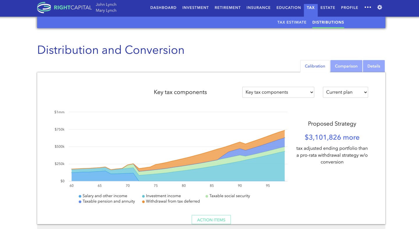
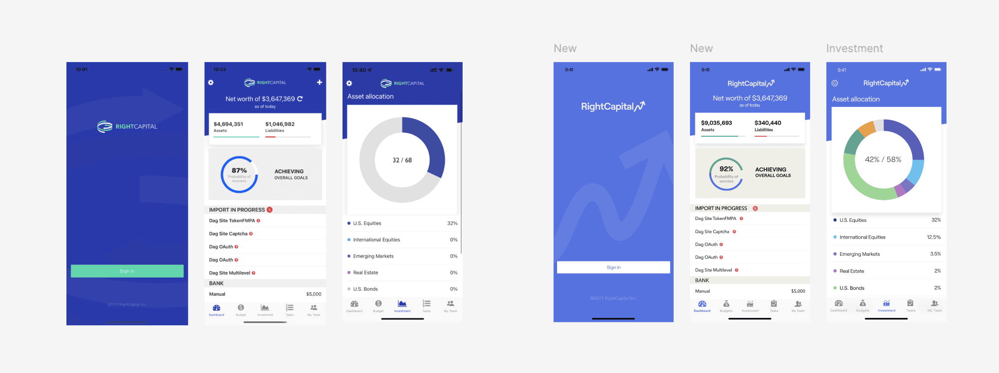
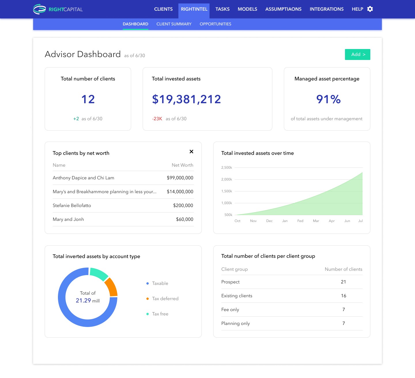
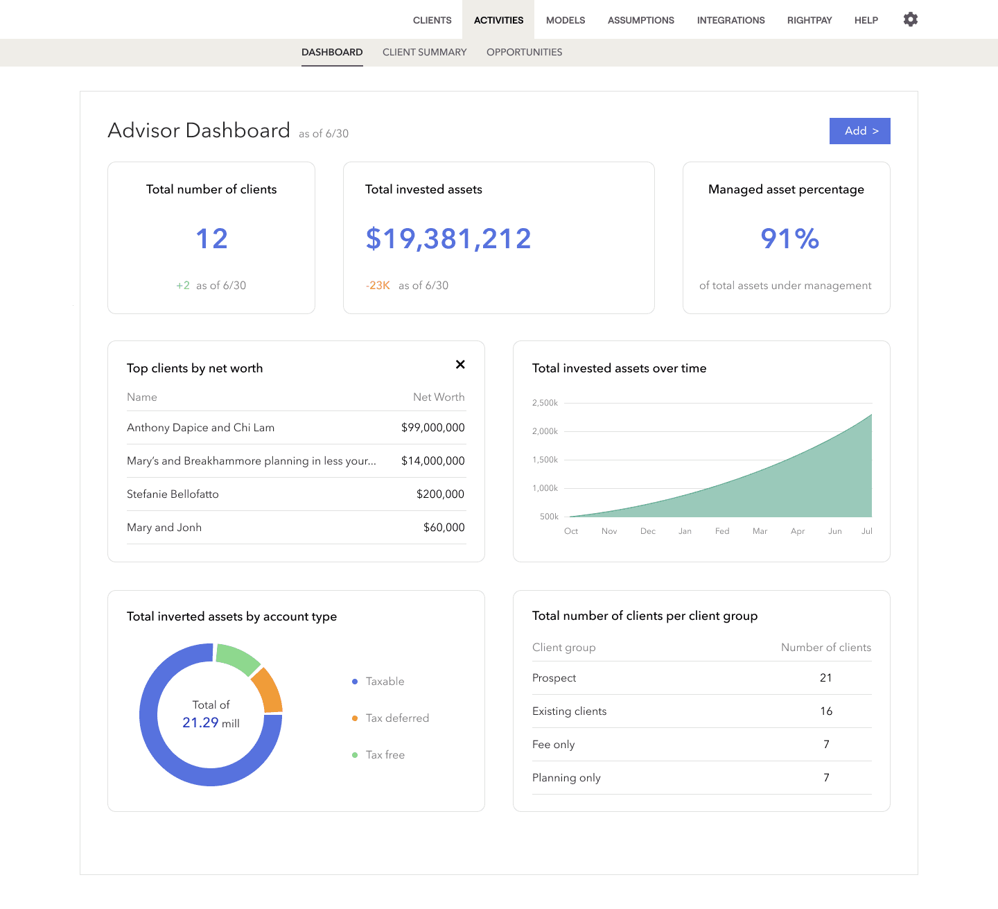
In the autumn of 2021, I joined RightCapital’s Beijing office as a UI/UX design intern. One of my key projects was the rebranding of the company’s website and mobile app, where I worked on redesigning interfaces, updating the logo, and revamping the UI design system and component libraries to align with the new guidelines.
After the rebranding, I also worked on designing new features like Snapshot and Blueprint. This was my first hands-on commercial experience after graduation, and it gave me valuable insights into how professional design processes work and how to collaborate effectively with cross-functional teams.
Rebranding
The goal of the RightCapital rebranding project was to create a dynamic, human, and forward-looking brand identity. By updating our logo, color palette, typography, photography, and iconography, we aimed to:
Modernize the Brand: Refresh the visual identity to reflect a contemporary and innovative image.
Improve User Experience: Enhance the usability and aesthetics of our website and mobile app interfaces.
Ensure Consistency: Maintain a uniform look and feel across all digital platforms.
Inspire Confidence: Use the new brand elements to create engaging stories and experiences for advisors and clients.
Integrate New Features: Seamlessly incorporate new features like Snapshot and Blueprint into the redesigned interfaces.
New Color Palette
In the redesign of RightCapital’s product, we introduced a modern color palette that aligns with contemporary design trends and supports our refreshed brand identity. The new color scheme significantly reduces saturation, employing a subtle range of grays and blues that not only soothe the eyes but also add a level of sophistication to the user interface.
Old
New
For the website, RC Cream is now the primary background color, with RC Purple used for text. RC Blue, which replaces the previous green, is applied to buttons and other interactive elements such as arrows and lines. These design choices not only enhance visual clarity but also strengthen brand recognition.
This strategic use of color not only improves the aesthetic appeal and modernity of the product interfaces but also ensures that the brand message is consistently conveyed across different applications, reflecting a modern, professional, and forward-thinking financial planning software brand image.
On the mobile platform, RC Blue is used predominantly, aligning with its foundational role in our color palette and prominent presence in RC logo.
Old
New
Subtle changes have been made to the colors used in the product's informational graphics to maintain consistency and prevent user confusion. These adjustments involved slightly reducing the saturation of the existing colors to better align with the new design standards, thus ensuring a seamless visual transition while preserving the interface's familiarity.
New feature: Bueprint
As part of my role at RightCapital, I was actively involved in the design of the Blueprint feature—a tool designed to enhance financial planning through visualization. Blueprint allows clients and their advisors to organize and interact with financial data effectively, providing a comprehensive view of financial goals and statuses through intuitive, interactive visuals.
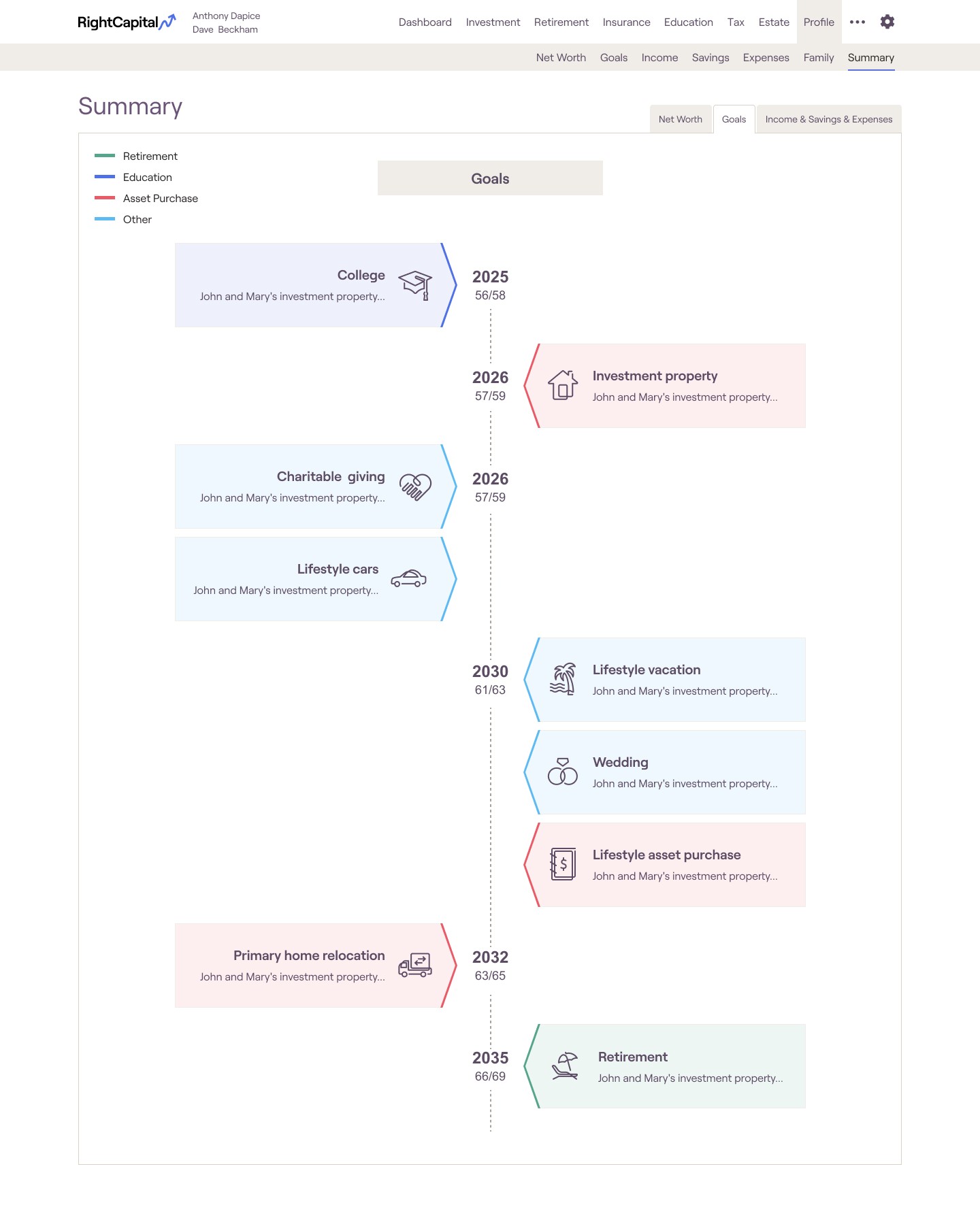
Summary-goals
Key features include visual categorization through distinct icons and color codes for quick identification of various financial objectives, and a chronological timeline arrangement that clearly outlines the sequence of future milestones. Interactive elements allow users to click directly on the timeline to adjust or explore details of their financial goals, making the planning process engaging and user-centric.
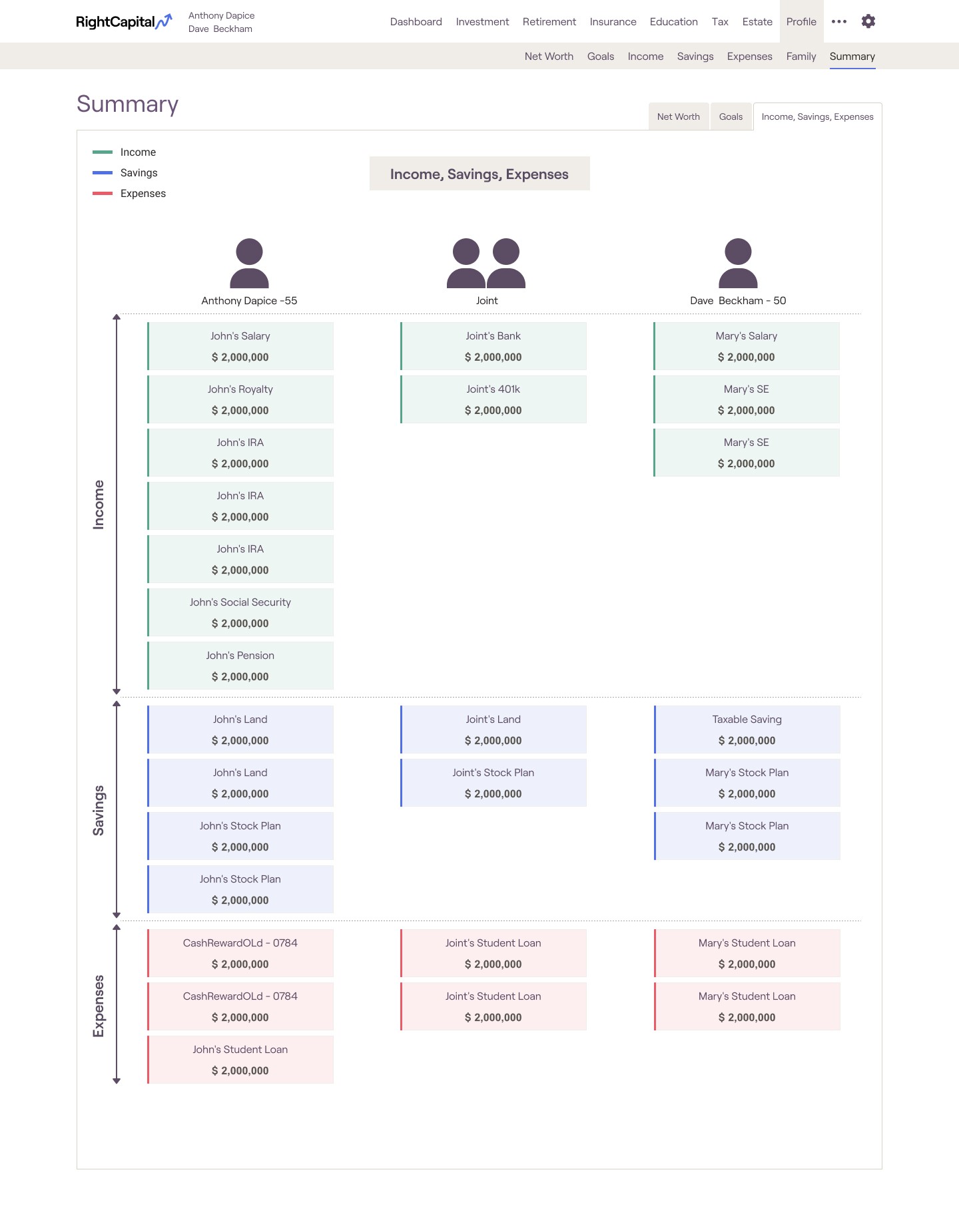
income, savings, expenses
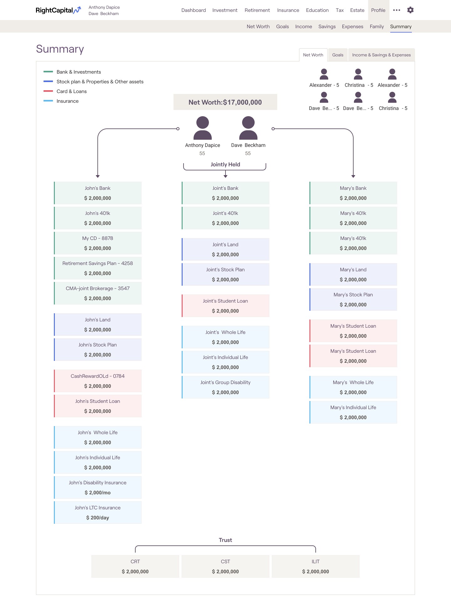
net worth
The "Income, Savings, Expenses" page uses a vertical bar graph with color coding to differentiate between various financial categories—green for income, blue for savings, and red for expenses. For the "Net Worth" page, the layout adopts a hierarchical flowchart approach. It meticulously organizes assets and liabilities into a clear, logical progression from individual to jointly held assets, culminating in the total net worth.
New feature: Snapshot
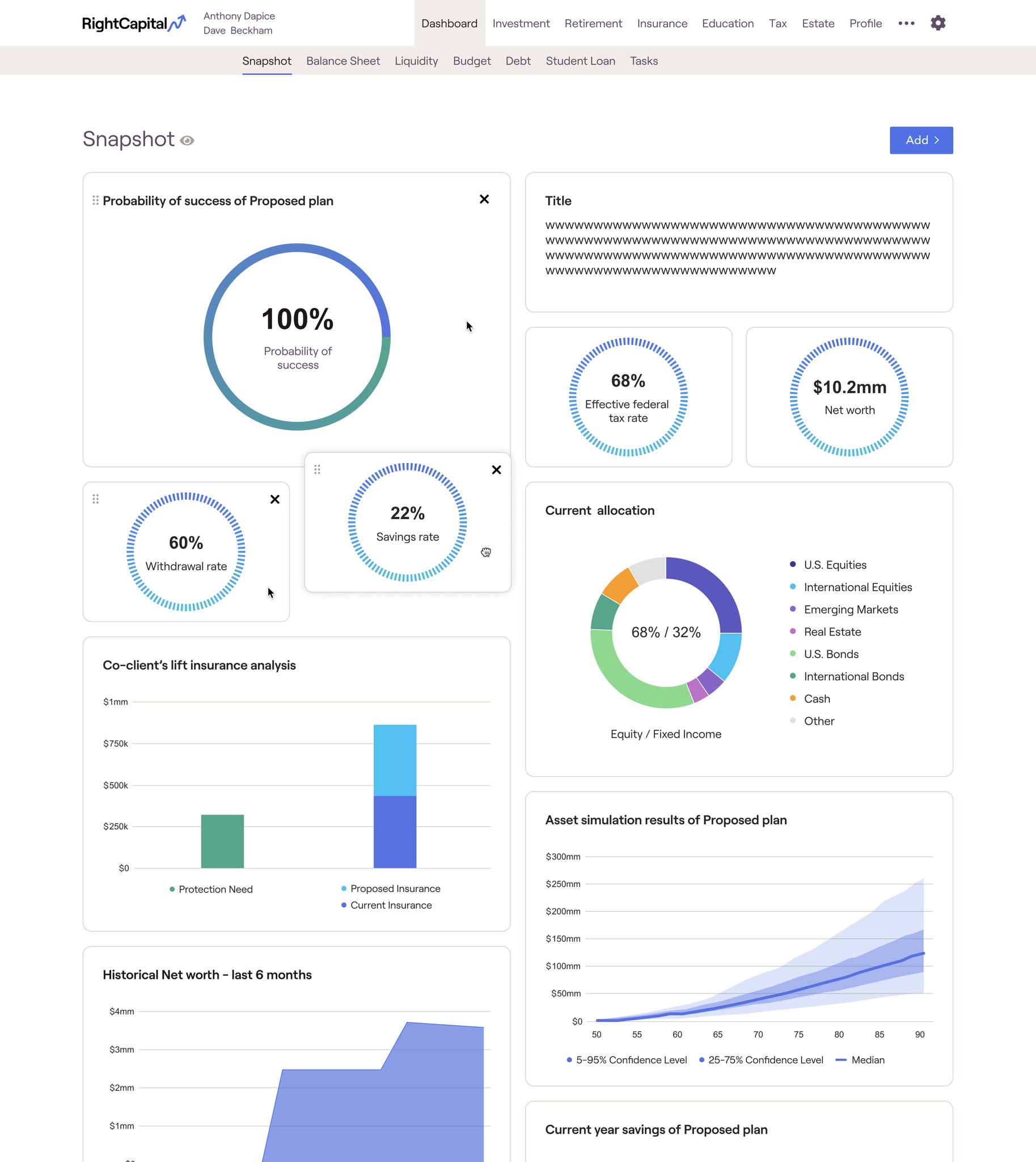
The "Snapshot" page design in RightCapital employs a clear, modular layout that efficiently organizes and displays key financial data using a variety of visualization techniques. Each module is interactive, allowing for customization and detailed data analysis. This design approach ensures that complex information is both accessible and visually appealing, facilitating quick understanding and decision-making for users.
